Context
The same workshop and the same content as the premium version, with a different character. I wanted to show that form, not only the words, decides how a website is received.
What I did
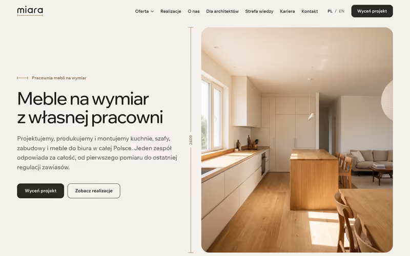
A light version with a simple layout: offer, projects, a page for architects, a knowledge base, careers and contact. The project quote sits in the header, next to the language switch.
Decisions
A light background, a sans-serif typeface and photos in rounded frames. The warm wood in the photos provides the colour, so the interface stays almost free of accents.